Electrolyte Drinks
| Maximus Fit
visual identity
logo design
packaging design
marketing materials
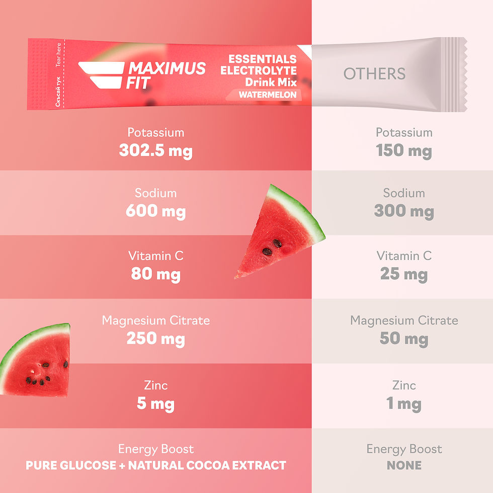
We created the visual identity of the electrolyte drinks brand Maximus Fit. We also developed the packaging design of their products, as well as marketing assets, used across online stores and social media for a cohesive, impactful brand presence.
marketing materials


Logo
The two elements implied in the logo are sports and dynamics. The stripes symbol reminds us of active and healthy lifestyle, the one that our customers would like to maintain. The italic letters speak of movement and carefree attitude.


Color Palette
We have various and everchanging color palette based on the different flavors, the combination of which can also turn into a gradient. Maximus Fit is a companion and provider on the journey to a healthy and fit but also fun life.


Packaging
Hip 4Family won a German Design Award 2026 in category passenger vehicles for seamlessly blending minimalist design with smart innovation, redefining comfort, space, and usability in compact mobile living.


Marketing Materials